I've just came back from a ski trip. I was skiing in a beautiful state of Vermont. The mountains were ready, perfectly covered with the white powder. It was a nice change from all that gray Maryland's scenery. Surprisingly there was not too many people there.

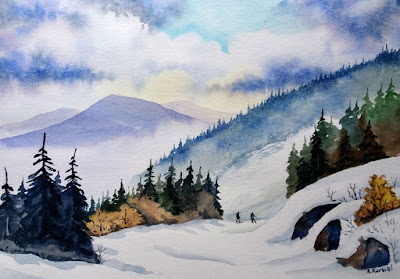
I began with making the sky more dramatic. I painted it with wet-in-wet technique. On the wet paper I threw yellow pale color just to add a little sunshine. Then I painted small part of the clear sky with cerulean blue. I carefully painted around white clouds. At the end I added darker tones to make heavier clouds. I used mixture of french ultramarine and crimson red.
Then I waited until everything dried out. After that, I painted the mountains starting with the farthest one. I used mixture of french ultramarine and crimson red.
The conifer trees were done with a combination of phthalo blue and yellow ocher. To create darker trees in the front I mixed french ultramarine and burnt umber. On my photograph, the trees are in all shades of gray. To change this and warm up the scene, I painted some bushes with yellow ocher and burnt sienna.
To emphasize skiers I painted them on a white background. I also narrowed the ski trail to eliminate the overwhelming whiteness of the snow in the foreground. Thanks to that, the skiers automatically became more pronounced. One of the skier's jacket had neon blue color. I found this tone too destructing so I changed it to the dark gray.
Now my dear readers it is your turn. You can take my photo and paint from it. Modify it to your taste and most of all enjoy the process. Start with quick pencil value sketch, it help to determine what you like. Let me know how it went :)

The views were spectacular and inspiring, especially from the mountain's summit. Although my sketchbook was in my bag all the time, I wasn't able to sketch. The wind was too cold to remove the gloves from my hands. Nevertheless I wouldn't be myself if I didn't take some photographs.
Here you can see one of my pictures. I took this one on the trail down the Ramshead Mountain. I knew right away that I would like the scene. Layers of mountains and small figures of skiers are great subjects for a watercolor painting.
Later at home I studied this picture in more detail. I noticed some drawbacks though. Heavy, gray clouds made this picture dull and almost monochromatic. Also the skiers were hardly visible on the dark background full of trees. I knew that I had to rearrange the composition of this picture a little.

I began with making the sky more dramatic. I painted it with wet-in-wet technique. On the wet paper I threw yellow pale color just to add a little sunshine. Then I painted small part of the clear sky with cerulean blue. I carefully painted around white clouds. At the end I added darker tones to make heavier clouds. I used mixture of french ultramarine and crimson red.
Then I waited until everything dried out. After that, I painted the mountains starting with the farthest one. I used mixture of french ultramarine and crimson red.
The conifer trees were done with a combination of phthalo blue and yellow ocher. To create darker trees in the front I mixed french ultramarine and burnt umber. On my photograph, the trees are in all shades of gray. To change this and warm up the scene, I painted some bushes with yellow ocher and burnt sienna.
To emphasize skiers I painted them on a white background. I also narrowed the ski trail to eliminate the overwhelming whiteness of the snow in the foreground. Thanks to that, the skiers automatically became more pronounced. One of the skier's jacket had neon blue color. I found this tone too destructing so I changed it to the dark gray.
Now my dear readers it is your turn. You can take my photo and paint from it. Modify it to your taste and most of all enjoy the process. Start with quick pencil value sketch, it help to determine what you like. Let me know how it went :)


